 |
| Images via Design Sponge. |
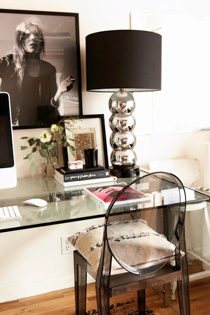
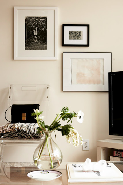
I love it when people pick a design concept and implement it throughout their entire space. It’s bold, it’s brash and it’s above all disciplined! No cake and eating it too here. In my quest to have it all I’ve definitely made the mistake of “this room is tan! and this room is tiffany blue! and this room is pink!” Hey, it’s where my mind was at that time. This beautiful apartment is seriously begging me to stick to a black, brass and lucite vibe. Shout out to the different textures especially that bangin’ chair vignette above.
More HERE. What design choices or trends were you into that you now think are comical? Two special words from my past are…First.Down. Do you know what that means? Did you know they came in silver? Let me see if I can find a photo for ya’ll.


